Analysis of Previous Results
Below is a video outlining my use of excel in the analysis of previous results to decide which class used 'Google Apps for Education' and which used 'MS Office'
Below are two original excel files, the first being the results for the previous year for year 9 and the latter being the results for 9 Green from this year as well as a comparison of results with 9 White. These are the files used in the above video and the outline below.
| year_8_2013_marks_anon.xlsx |
| year_9_green_2014_marks_anon.xlsx |
Analysis of Previous results - Outline.
I recently performed some action research with two year 9 classes and MS Excel was used to first analyse their previous results. Results were looked at from the previous year up until the action research activity meaning 18 months of data was used.
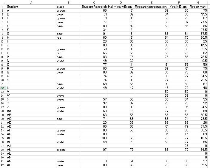
The data was downloaded from my school's system for ALL of year 8 2013 and also the two year 9 classes studied from 2014.
First I had to sort the data from year 8 2013 to only include the students in the two year 9 classes studied in 2014 in order to compare the same students. Because of this all of year 8 2013 needed to be downloaded and then excel used to sort them.
Excel is a powerful tool in being able to compare students: with each other, to averages, as well as with themselves to see if they have improved or not over time. I wanted to see if my two year 9 classes (9 white and 9 green) were similar in ability or not before beginning the action research task.
To be able to compare the same students, who from year to year change classes, I needed to add a column to the data called 'class' and put in their class name. we use colours: Blue (B); Green (G); Red (R); White (W) for our classes.
Below is the raw data from the previous year with the class column added:
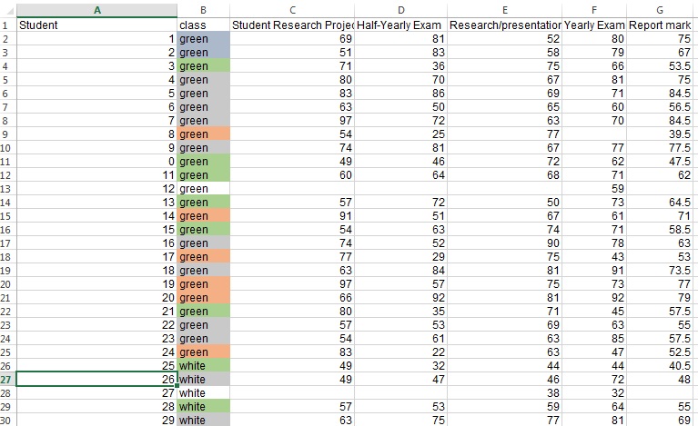
Notice that the students are not sorted into classes as they are in alphabetical order, I also had not quite completed the class categories in the above example. To compare the Green (G) and Red (R) class then the data was first sorted using the 'class' column, in this case 'B'.
This sorting is shown in the image below:
This sorting is shown in the image below:
Averages for the whole year group as well as 9G and 9W were also calculated as shown on a previous page of this website

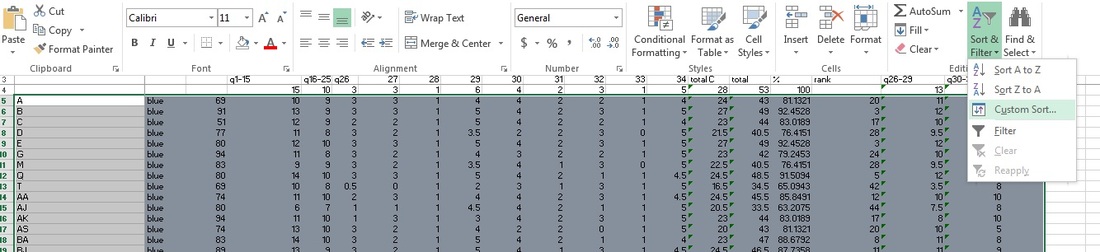
The next 4 images below show how sorting was done on another tab of the spreadsheet that included detailed marks on the students half yearly examinations. Below is an image that shows the students in alphabetical order. To get the two classes I wanted I needed to first sort them into classes.
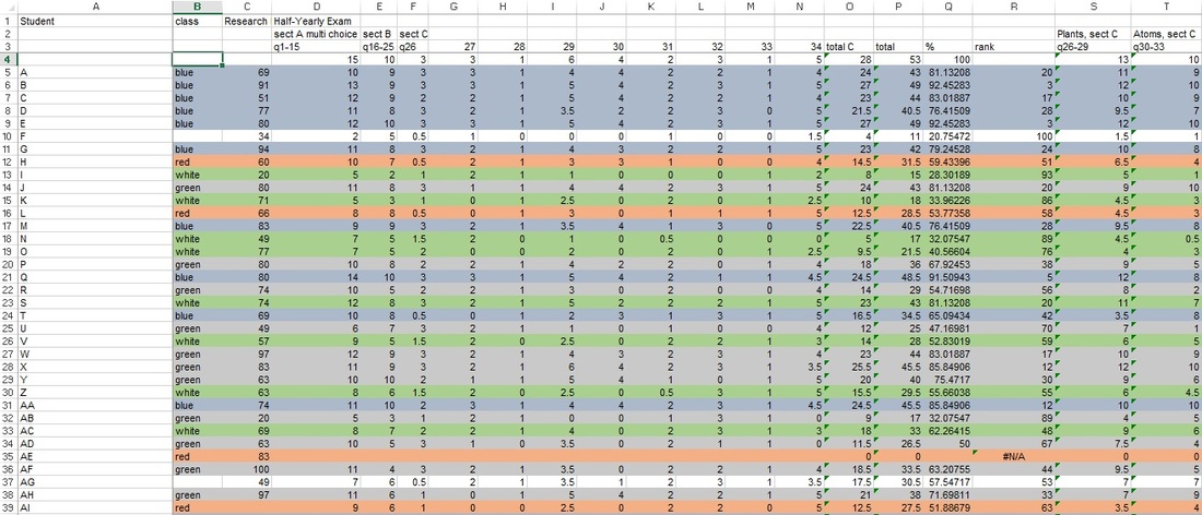
To do the sorting the following procedure was completed: 1. To sort the students first select ALL of the cells that require sorting, that is the students name, class, and all the results in adjacent cells. Then on the 'home' tab click on 'sort and filter' then 'custom sort'
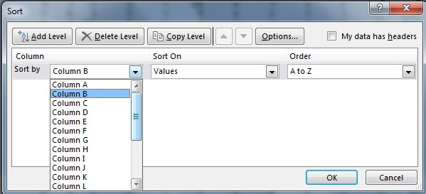
2. A dialogue box then appears where in this case 'column B' was chosen as it contained the class names.
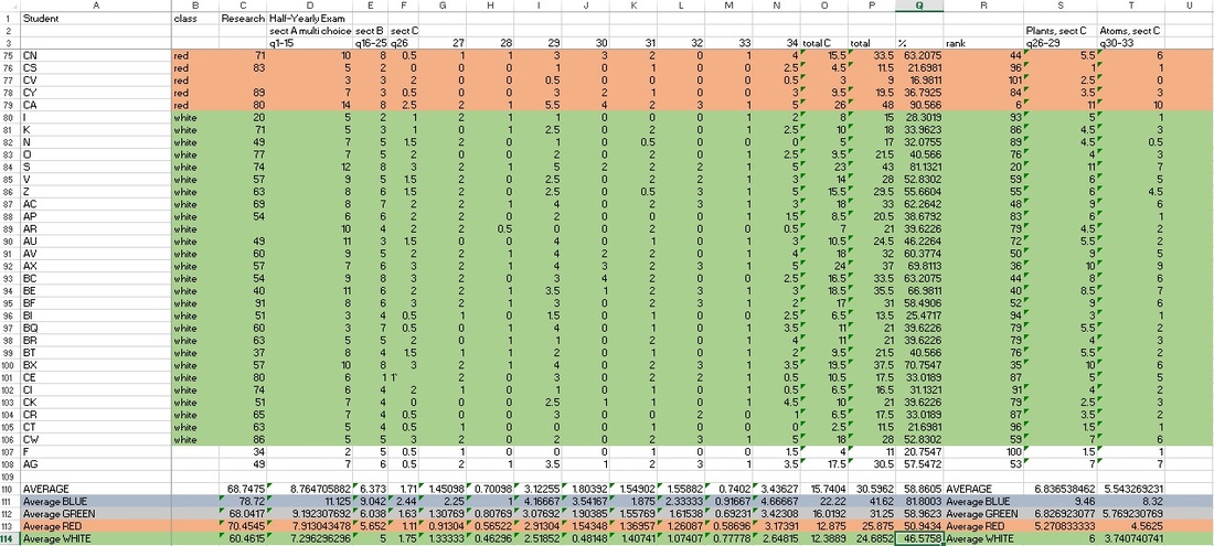
Once the 'OK' button was clicked then the below resulted where students are sorted first by class and then within their class alphabetically.
As can be seen at the bottom of the page (click on image for clearer view) the averages for each class can then be calculated without resorting to an 'IF' statement.
As can be seen at the bottom of the page (click on image for clearer view) the averages for each class can then be calculated without resorting to an 'IF' statement.
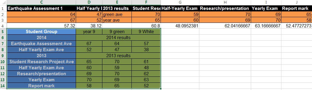
Once the class and whole year average was calculated by excel I could then generate a table for each class with their averages as compared to the whole year average. The table for 9 green is shown below.
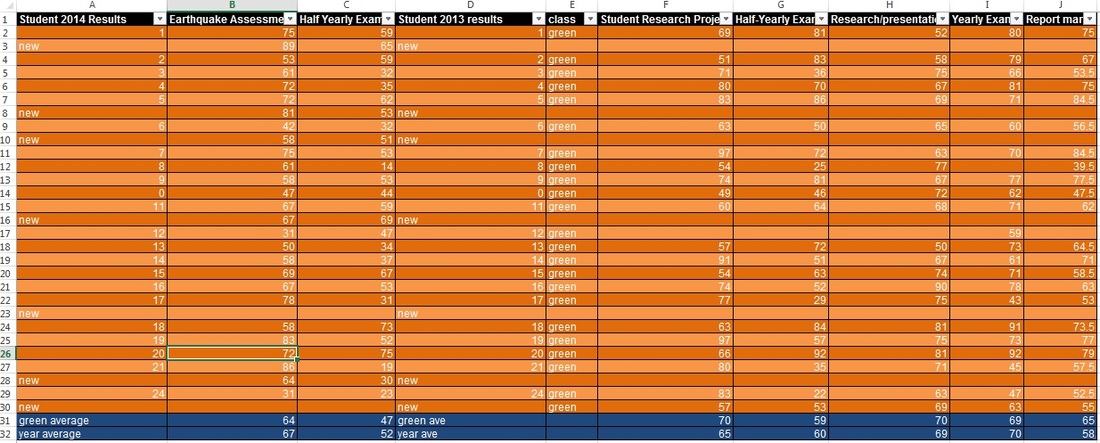
Below is a summary and comparison of the two classes results that was used in the action research from the use of excel. As can be seen below, 9 green, on average, were better for every task in the previous 18 months compared to 9 white. It was from these results that the decision was made to have 9 white use the 'Google apps for education' and 9 green to use Microsoft word and Powerpoint in examining the benefits of the former on student learning. The idea was to see if the use of Google apps would bring 9 white up to the level or above of 9 green.