Graphing with Excel.
Pivot Tables & graphs Video
Note: the public version of this site has had videos and images removed that would compromise privacy including on this page.
As part of my action research analysis of pre-quiz and post-quiz data I used ‘pivot tables and graphs’. I decided on these as they are very useful when wanting a flexible graphing option that can be changed very easily. They are also good for graphing frequency distribution graphs which is what I wanted to compare each class’s results from pre-quiz to post-quiz and also to compare each of the two year 9 classes.
As part of my action research analysis of pre-quiz and post-quiz data I used ‘pivot tables and graphs’. I decided on these as they are very useful when wanting a flexible graphing option that can be changed very easily. They are also good for graphing frequency distribution graphs which is what I wanted to compare each class’s results from pre-quiz to post-quiz and also to compare each of the two year 9 classes.
Below is the original excel file containing the final table and graph to compare the pre-quiz and post-quiz results between the two year 9 classes.
| 9_science_white_and_green_frequency_comparison.xlsx |
Pivot Tables & graphs Outline
1. I selected the columns on the table that I wanted graphing:
2. Then I clicked on ‘pivot chart’ in the ‘insert’ tab:
3. Then click ‘ok’ on the ‘create pivot chart’ pop up box. The following appears by default in another tab but can be selected to appear on the same tab as the table
3. Then click ‘ok’ on the ‘create pivot chart’ pop up box”. The following appears by default in another tab but can be selected to appear on the same tab as the table

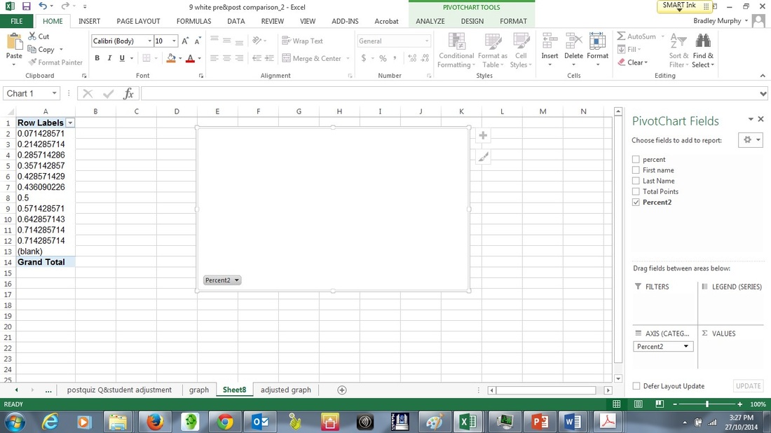
4. Then I clicked on and dragged the ‘percent2’ field down to the ‘Axis (categories) and ‘values’ pivot chart areas as shown in the two screen shots below generating a pivot table and graph in the process.
5. Such tables and graphs are very easy to change simply by dragging the fields into or out of different areas.
As can be seen in the screenshot below the graph and associated table needs some adjusting.
As can be seen in the screenshot below the graph and associated table needs some adjusting.
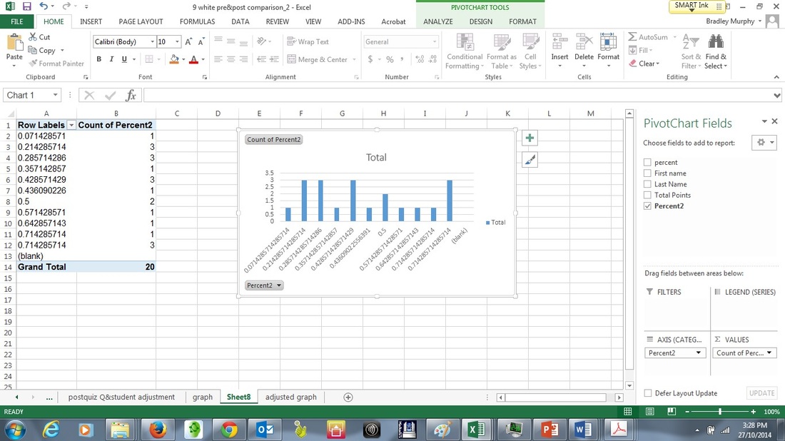
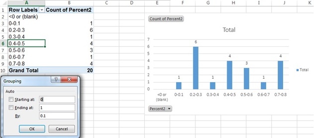
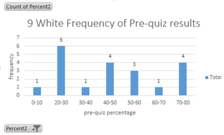
6. I wanted to ‘group’ the data so I counted the numbers (frequency) of students who got marks in bands of 10%, that is 0-10, 11-20; 21-30 etc.
To do this click in the first column (‘Row Label’) and right click then select ‘group’.
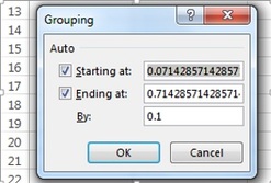
A dialogue box popped up as shown to the right which I clicked ‘ok’ but then changed later.
To do this click in the first column (‘Row Label’) and right click then select ‘group’.
A dialogue box popped up as shown to the right which I clicked ‘ok’ but then changed later.
7. The table and graph now look like:
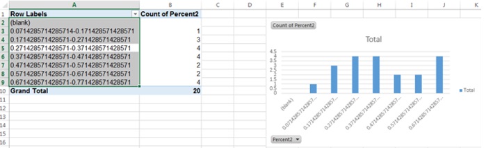
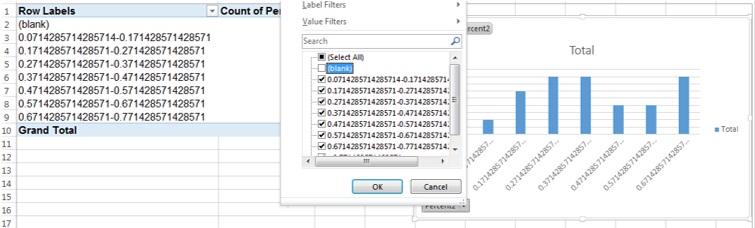
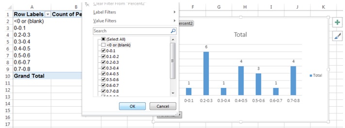
8. I did not want the ‘blank’ field so I clicked on the drop down arrow just to the left of ‘count of percent2’ in the table and unselected ‘blank’
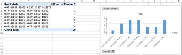
The result was as follows:
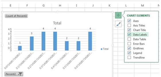
9. I then wanted to add ‘data labels’ above the columns in the table to make it clear what the number of students were who answered in each percentage band.
10. I then decided to revisit grouping and manually changed ‘starting at’ to ‘0’ and ending at to ‘1’ and ‘By’ to ‘0.1’. The result can be seen to the left.
I then had to deselect the <0 or (blank) field again:
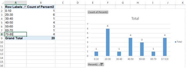
11. I then changed the decimals (0 to 1) to ‘percentages’ out of 100:
12. I then added graph title and axes labels
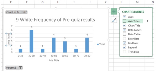
Job Done!
|
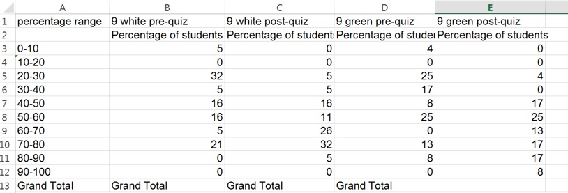
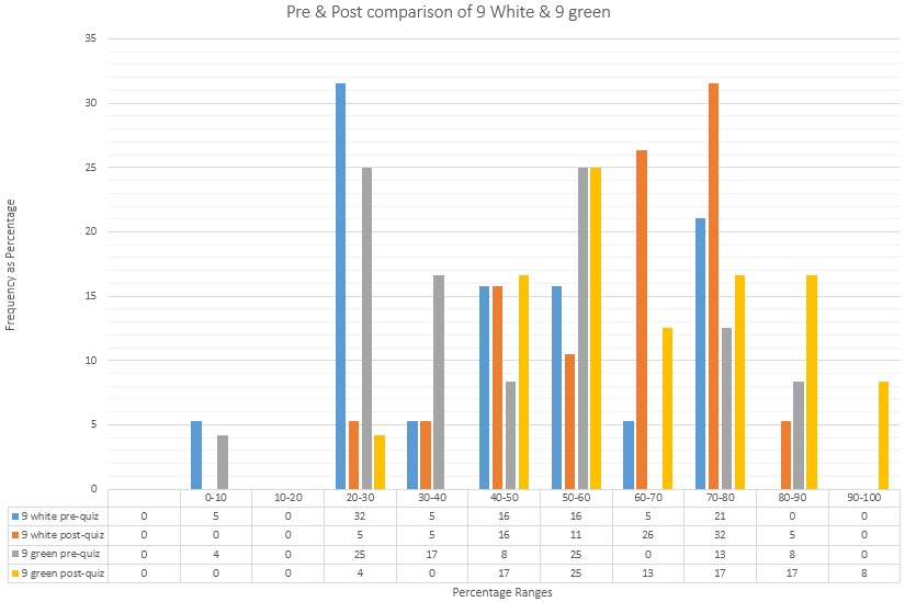
|
In order to analyse the pre-quiz and post-quiz data from the two year 9 classes that I did the action research on I decided to generate a colour coded column graph and table with all this data in one place. Below is the table then the graph that was generated from it.